From Surf Wiki (app.surf) — the open knowledge base
Initial
Oversized first letter in a text block

Oversized first letter in a text block
In a written or published work, an initial is a letter at the beginning of a word, a chapter, or a paragraph that is larger than the rest of the text. The word is derived from , which means of the beginning. An initial is often several lines in height, and, in older books or manuscripts, may take the form of an inhabited or historiated initial. There are certain important initials, such as the Beatus initial, or B, of Beatus vir... at the opening of Psalm 1 at the start of a Vulgate (Bible). These specific initials in an illuminated manuscript were also called initia (: initium).
History

The classical tradition was slow to use capital letters for initials at all; in surviving Roman texts it often is difficult even to separate the words as spacing was not used either. In late antiquity (–6th century) both came into common use in Italy, the initials usually were set in the left margin (as in the second example below), as though to cut them off from the rest of the text, and about twice as tall as the other letters. The radical innovation of Insular illumination was to make initials much larger, not indented, and for the letters immediately following the initial also to be larger, but diminishing in size (called the "diminuendo" effect, after the musical term). Subsequently, they became larger still, coloured, and penetrated further and further into the rest of the text, until the whole page might be taken over. The decoration of insular initials, especially large ones, was generally abstract and geometrical, or featured animals in patterns. Historiated initials were an Insular invention, but did not come into wider use until the later developments of Ottonian art, Anglo-Saxon art, and the Romanesque style in particular. After this period, in Gothic art large paintings of scenes tended to go in rectangular framed spaces, and the initial, although often still historiated, tended to become smaller again.
In the very early history of printing, the typesetters would leave blank the necessary space, so that the initials could be added later by a scribe or miniature painter. Later initials were printed using separate blocks in woodcut or metalcut techniques.
File:Ann Arbor, University of Michigan P.Mich.inv. 6238 (Papyrus 46) fol. 142r - 2 Corinthians 11,33-12,9.jpg|Greek biblical text from Papyrus 46, of c. 200, with no initials, punctuation, and barely spaces between words File:Codex Alexandrinus f41v - Luke.jpg|5th century Codex Alexandrinus with initials in left margin File:Leaves from a Coptic Manuscript MET sf21-148-1as2.jpg|Leaf from a Coptic manuscript, 6th-14th century, Metropolitan museum of Art, New-York File:CathachOfStColumba.jpg|"Diminuendo" effect in the first letters after this initial from the Cathach of St. Columba (Irish, 7th century) File:KellsDecoratedInitial.jpg|One of thousands of smaller decorated initials from the Book of Kells File:Meister der Franko-Sächsischen Gruppe 001.jpg|In principio from the start of the Gospel of John, 9th century File:Illuminated capital letter D, Mokvi Gospels (2).jpg|Illuminated Georgian letter "D" from the Mokvi Gospels File:JesseTree.jpg|Large initial L from a Romanesque Bible File:Mainz - Johann Fust & Peter Schoeffer (printers) - Mainz Psalter - Google Art Project.jpg|Opening from the Mainz Psalter, printed in 1457, with small printed and large drawn initials. File:Fraktur.png|Fraktur File:Agricola.jpg|Alexander Agricola's score: "Fortem virili" Lettrine et petites capitales.JPG|Two row-wide P initial, followed by small capitals
Since 2003, the W3C is working for initial letter modules for CSS Inline Layout Module Level 3, which standardized the output of initial letters for web pages.{{cite web
Types of initial
The initials are morphologically classified: the rubricated letter (red); the epigraphic letter, imitating ancient Roman majuscules; the figurated initial (usually in miniatures); the historiated initial, that gives spatial support to scenes of a narrative character; etc.
The size and decoration of the initial further gives clues to both its importance and location. Letters that began a new section of a text or a particularly noteworthy section might receive more flourishes and space. They would also provide a visual point of reference, "marking the division of the text into books, chapters, paragraphs and sometimes even verses" since, due to the cost of parchment, the modern convention that a new section will begin on a new page had not emerged. In luxury manuscripts an entire page might be devoted to a historiated initial.
Both the size and the ostentatiousness of a manuscript reflect both on the status of the manuscript and on its owner. Manuscripts meant for everyday use, typically by friars or university students, often had little illumination, and hardly any elaborate historiated initials or flourishes. Manuscripts commissioned by wealthy patrons or for a wealthy monastery were often illuminated, and in gold or silver rather than pen and ink.
The initial may sit on the same baseline as the first line of text, at the same margin, as it does here. This is the easiest to typeset on a computer, including in HTML. For example:
Lorem ipsum dolor sit amet, consectetur adipisicing elit, sed do eiusmod tempor incididunt ut labore et dolore magna aliqua. Ut enim ad minim veniam, quis nostrud exercitation ullamco laboris nisi ut aliquip ex ea commodo consequat. Duis aute irure dolor in reprehenderit in voluptate velit esse cillum dolore eu fugiat nulla pariatur. Excepteur sint occaecat cupidatat non proident, sunt in culpa qui officia deserunt mollit anim id est laborum.
Alternatively, the initial may be in the left margin, with the text indented, as shown here. In word processors and HTML, this may be implemented using a table with two cells, one for the initial and one for the rest of the text. The difference between this and a true drop cap may be seen when the text extends below the initial. For example:
| L | orem ipsum dolor sit amet, consectetur adipisicing elit, sed do eiusmod tempor incididunt ut labore et dolore magna aliqua. Ut enim ad minim veniam, quis nostrud exercitation ullamco laboris nisi ut aliquip ex ea commodo consequat. Duis aute irure dolor in reprehenderit in voluptate velit esse cillum dolore eu fugiat nulla pariatur. Excepteur sint occaecat cupidatat non proident, sunt in culpa qui officia deserunt mollit anim id est laborum. |
|---|
Drop cap
With a drop cap, the initial sits within the margins and runs several lines deep into the paragraph, indenting some normal-sized text in these lines. This keeps the left and top margins of the paragraph flush.
In modern computer browsers, this may be achieved with a combination of HTML and CSS by using the float: left; setting. An alternate CSS-only method can instead use the :first-letter pseudo-element. For example:
Lorem ipsum dolor sit amet, consectetur adipisicing elit, sed do eiusmod tempor incididunt ut labore et dolore magna aliqua. Ut enim ad minim veniam, quis nostrud exercitation ullamco laboris nisi ut aliquip ex ea commodo consequat. Duis aute irure dolor in reprehenderit in voluptate velit esse cillum dolore eu fugiat nulla pariatur. Excepteur sint occaecat cupidatat non proident, sunt in culpa qui officia deserunt mollit anim id est laborum.
In some older manuscripts, the first letter of normal sized text after a drop cap also would be capitalized, as may be seen in the Mainz Psalter above, and in the original 1609 printing of Shakespeare's sonnets. This evoked the handwritten "diminuendo" style of gradually reducing the text size over the course of the first line. This style now is rare, except in newspapers.
Inhabited initial
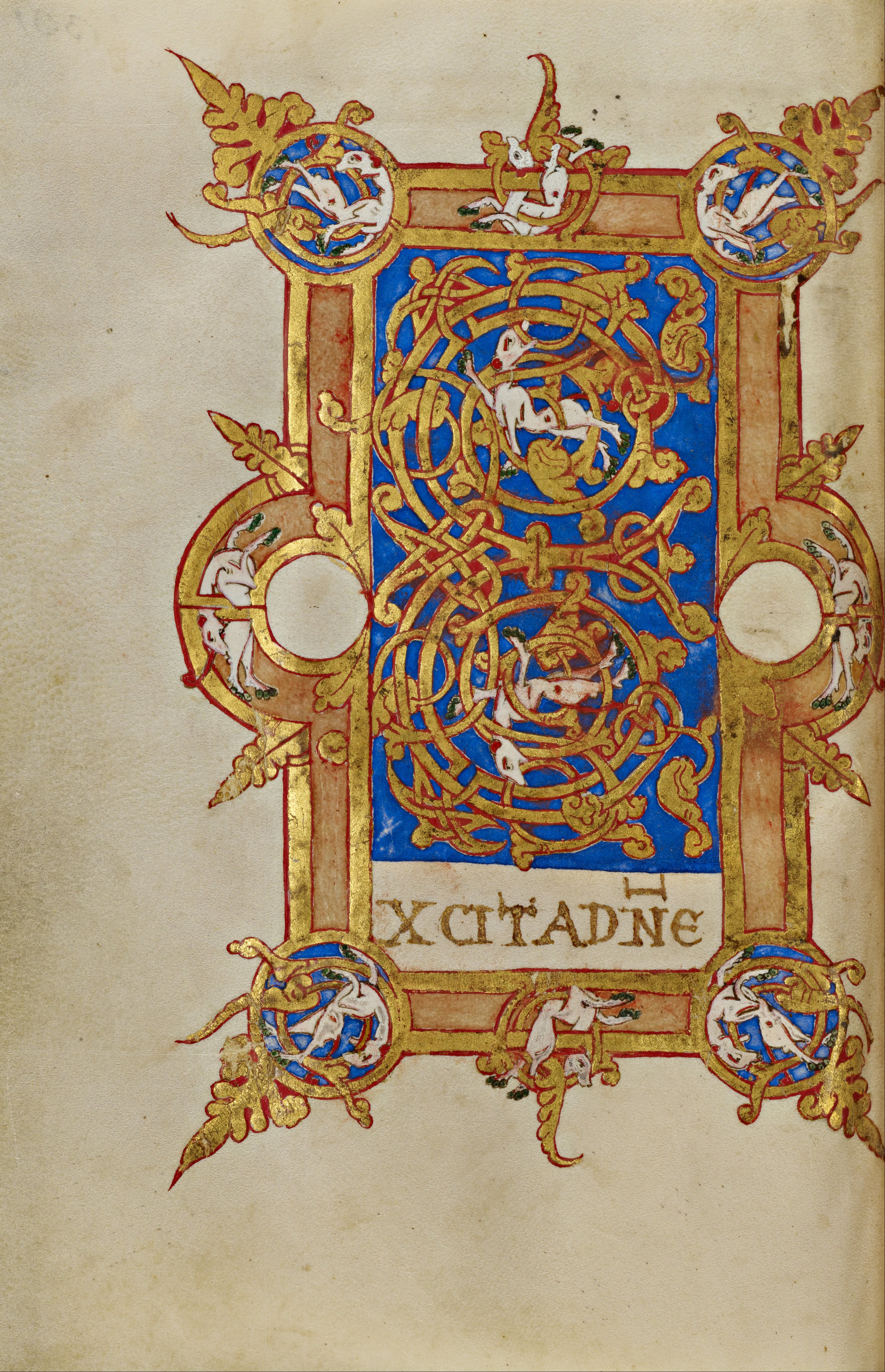
An inhabited initial is an initial, an enlarged letter at the beginning of a paragraph or other section of text that contains an illustration of human or animal figures within the letter. It is similar to a historiated initial (see below); however, the figures in historiated initials show an identifiable scene or story, while the figures in inhabited initials do not show a narrative. Figures in inhabited initials may be related to the contents of the text, but do not have to be. They may be purely decorative instead.
Historiated initial
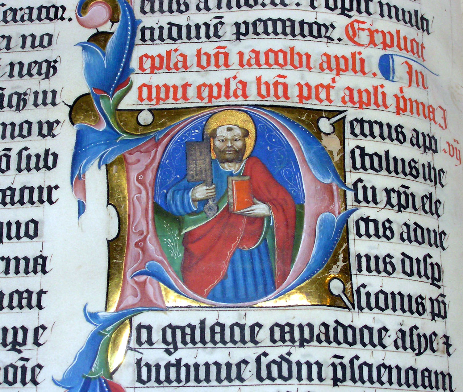
A historiated initial is an initial, an enlarged letter at the beginning of a paragraph or other section of text, that contains a picture. Strictly speaking, a historiated initial depicts an identifiable figure or a specific scene, while an inhabited initial (see above) contains figures (human or animal) that are decorative only, without forming a subject. Both sorts became very common and elaborate in luxury illuminated manuscripts. These illustrated initials were first seen in the Insular art of the early 8th century. The earliest known example is in the Saint Petersburg Bede, an Insular manuscript of 731–46, and the Vespasian Psalter has another.
Opening quotation marks
There is no accepted solution for how to handle initials if there is an opening quotation mark before the first letter. The Chicago Manual of Style offers two options: leave out the opening quotation mark entirely; or have it be the same size as the initial, as shown below.
"Lorem ipsum dolor sit amet." Consectetur adipisicing elit, sed do eiusmod tempor incididunt ut labore et dolore magna aliqua. Ut enim ad minim veniam, quis nostrud exercitation ullamco laboris nisi ut aliquip ex ea commodo consequat. Duis aute irure dolor in reprehenderit in voluptate velit esse cillum dolore eu fugiat nulla pariatur. Excepteur sint occaecat cupidatat non proident, sunt in culpa qui officia deserunt mollit anim id est laborum.
Notes
References
Sources
References
- (17 June 2019). "Drop caps & design systems". [[Vox Media]].
- MacDonald, Elizabeth. (10 January 2019). "Lighting the Way: How Illuminated Initials Guided Medieval Readers through Books". [[Europeana.
- "Inhabited Initial E". Getty Museum.
- "Glossaries: I". The British Library.
- (2004). "The Oxford Dictionary of Art". Oxford University Press.
- (2017). "The Chicago Manual of Style". [[The University of Chicago Press]].
This article was imported from Wikipedia and is available under the Creative Commons Attribution-ShareAlike 4.0 License. Content has been adapted to SurfDoc format. Original contributors can be found on the article history page.
Ask Mako anything about Initial — get instant answers, deeper analysis, and related topics.
Research with MakoFree with your Surf account
Create a free account to save articles, ask Mako questions, and organize your research.
Sign up freeThis content may have been generated or modified by AI. CloudSurf Software LLC is not responsible for the accuracy, completeness, or reliability of AI-generated content. Always verify important information from primary sources.
Report